
What do you think of the pink color? Are you the one that confers that it is a girl’s color? Or is it theirs? How to Make Pink Color and Shades ? And what makes this color important? Is it a combination of different colors, or is it a color? What Colors Make Pink? Have anything in mind?
You will learn about the various colors of pink and how they differ. You will learn how to blend them from the lightest shade, coral pink, to the deepest shade, blush pink.
This post will demonstrate to you how to blend different tones of pink. You will learn how to make different shades of pink, what colors to go with pink, and more. There are also suggestions for creating ideal pink tones.
Why Is Pink Important?
What does pink mean? Pink is associated with little girls and feminine things, like flowers and princesses. Unicorns are often associated with pink, and you shouldn’t ignore the pink colors.
They are so beautiful to look at. It’s not only for girls to enjoy pink; boys also like to wear pink colors. Pink is a bold and exciting color that can add some vigor to your designs.
We know that warm colors are more emotional and passionate than cool shades, but what about pink precisely? What feelings does it conjure up when we see it on a wall or in an advertisement?
Pink is the perfect color for love and relationships because it is considered feminine. A red rose means that your passion is bright and burning; a pink one means that your feelings are softer and more tender.
Pink has been associated with both positive and negative emotions, depending on how it is shaded. Pink that’s lighter and not as red will make you feel happier. Darker and with more red can create a feeling of passion. White makes the pink seem brighter and softer, evoking a more soothing reaction.
Comforting Effects of Color Pink
Pink’s light red hues have several emotional and psychological effects. It’s thought that one of these is that it has a calming effect on people who see it.
Some people like to wear brighter hues because they’re optimistic, and they often choose hues like pink and light red for their works of art, clothing, and hair color.
Pink is also associated with a sense of care and nurturing, perhaps because it’s a color that’s often more feminine, and society tends to associate girls and women with being more caring and compassionate.
Despite any political implications, pink certainly imparts a sense of nurturing. Like the color for breast cancer awareness, pink encourages feelings of hope and compassion.
Soothing Color of Innocence
The most common associations of the color pink are that of all the things little girls love. From ballerinas to Barbie dolls, pink can make us feel nostalgic for our days of youth, freedom, playfulness, and innocence.
Girls’ toys most commonly have one or more shades of pink, and seeing pink can sometimes stir up feelings of warmth and safety. Different shades of pink are also strongly associated with sweets and treats.
A wide range of sweet producers use shades of pink in their confections and packaging. Pink is a popular choice for candy decorations and the icing on doughnuts and cupcakes. It’s an excellent color for attracting attention to your products and increasing sales.
Also Read: How to Wear a Bandana Men
Pink: A Color for Everyone
People have different personalities, so there’s no single shade of pink that will work for everyone. However, if you know which shade of pink will make you feel a certain way, you’ll know how to pick colors for your home and wardrobe accordingly.
Choose from thousands of color options to create beautiful, unique designs. For example, it’s essential to find the right pink shades when you want to look sweet. The best pink shades are more baby and pastel colors like light pinks and corals when you want to look like a little kid.
You’ll want to consider your base color, the primary color you’re going for with your new color. For pink, your base color is red, and your shade of red will determine what pink shades you have available to choose from. The color wheel includes many shades of red. Warm reds are usually considered to be more pleasant than excellent reds.
A Guide to Navigating Color Biases
When you talk about a particular color on the color wheel, such as red or green, you refer to its temperature or hue but not its brightness. However, the actual color of each object is dependent on its actual hue or usefulness.
The warm red colors include scarlet red, cadmium red, Venetian red, and red vermillion. When combined with other shades of red and white, these warm colors create a light pink shade. An excellent red color, such as deep crimson, will give a deeper pink.
Warm reds tend to be a little more vibrant, like Coquelicot red, alizarin crimson, vermilion, and carnelian red. Here are some cool red shades that are slightly more muted: rose pink. Light pink, Salmon, Rose, etc.
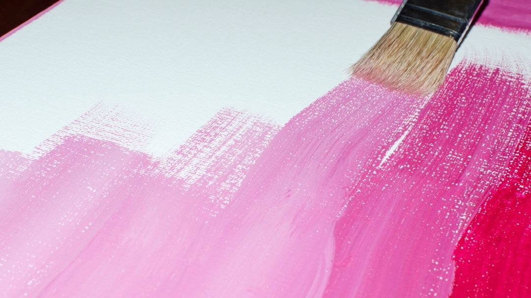
How to Make Pink with Different Shades of White?
Making Pink with Different Shades of White is a fun way to add different colors to your home decor, even if you don’t have a background in fashion design. You’ll find out how to get the right color, plus you’ll learn which kind of white is best for the project.
The first white that you can mix with your red to make pink is zinc white. It is a little more translucent than other options. The second white you can use is titanium white. In comparison to zinc white, titanium white is much more opaque.
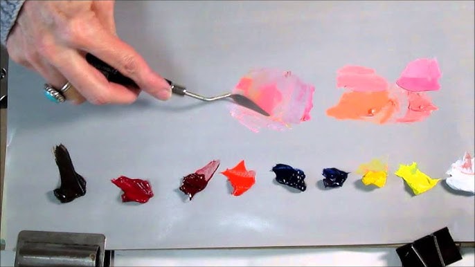
The best way to work out the various ratios for the different colors you need to make various shades of pink is to try it out yourself. We have a rapid and easy exercise that you can use to experiment with making a few different shades of pink. All you need is a sheet of paper, all of your red shades, each of these white shades (if you have them), and a little lemon yellow.
The first step is to start with the blue, then the red, and finally the pink. Mix up a small amount of each color and paint a few swatches. Next, mix a little more of each color and add some of that mixture to the next square. Continue the process until you’ve painted all four squares.
You will notice that each of these red shades is slightly different when adding titanium white. Try painting the red colors on each square and mix in a small amount of titanium white.
You will find that the tone of these pink shades differs quite a bit from the pink tones with zinc white. They’re much more opaque, and they darken the pink color. If you use them as an eye shadow base, it will darken your colors. Another important note is that both white shades lighten the color, but they dull the pink colors rather than brightening them.
Why Pink Is So Special and What Science Says About It?

Pink is a beautiful color, and it’s made up of two colors combined in the same place. So how do you make pink? To learn how to make the color pink, you need to mix red and white.
Pink is the name of the color of the light that bounces back from objects. It’s not a particular color but rather a mixture of all the colors in the spectrum. The light that bounces back has a shorter wavelength than the absorbed light.
It’s easy to see why you see colors on your paper when you draw with white. White light reflects the full spectrum of color.
The best art supplies absorb all colors equally and reflect none. Black is the absence of all colors, so it looks black to us. Scientists do not consider black a color; they call it a “colorless” or “black-bodied” object.
So sometimes, all color bounces off, and it appears white. Sometimes none does, and it appears black. But usually, an object has some other color like red, blue, or green which is the wavelength of light reflected by the object!
It’s impossible to answer a question about the speed of light when we don’t even know what a wavelength is! So, what is a wavelength? It’s sort of like a beach. When the waves are low and far apart, they look like an extensive line. If you go to the end of that line, you will see where the next wave starts. You measure the distance between those two waves, and that’s how you get the wavelength.
The wavelength of light is similar to how far apart the waves in a pool are. Your eyes see the light as they bounce off objects much smaller than the wavelengths.
The spectrum of light is the range of all possible wavelengths. Light of different wavelengths produces different colors like red light creates red light, violet light creates blue light, etc.
The shorter the wavelength, the “cooler” the color appears. (We’ll talk more about “cool” and “warm” colors later.) However, when we look at the entire range of visible light, from blue to red, the wavelengths of each color are concise. We simply don’t see them because our eyes only register about one octave of the spectrum.
But the possible wavelengths of light extend almost infinitely in either direction outside that tiny range. Some animals can see more of the available spectrum, like butterflies and reindeer.
The range that humans can see unaided by technology is called the “visible spectrum.” Red, a primary component of pink, falls at just around 700 nanometers in wavelength and is one of the longer wavelengths than we can see.
If there is a distance between one object and another, something is between them. More than anything, the distance between objects can cause a distance between us. And that’s where color comes into play because even though the color is only a spectrum of wavelengths of light, there are millions of unique shades.
This book explains why it’s red but not pink, even though that color results from the mixture of red and white wavelengths of light.
If any wavelength equaling 700 nm is mixed with the entire visible spectrum, we know it’s red. But it’s easier to understand if we break it down in a little more detail. In the next section, we’ll dive into “color mixing.”
Debunking Myths about the Color Pink
This section will discuss the myths mostly related to the color pink.
No Such thing as Pink
I believe in this myth. I don’t think there’s any color that isn’t out there. Pink was once a very unpopular color until the 18th century. Dianthus, the flower named after it, is an ancient plant. The first recorded use of the name “pink” for a color occurred in 1735.
People wore shades of red or purple previously, but as we noted in the beginning, you can mix pink with other colors through additive and subtractive color mixing. Michael Moyer of Scientific American points out, “Pink is real, or not, but it is just as accurate or not-real as red, orange, yellow, green, blue, indigo and violet.
Is Pink a girls’ color only?
Do not buy any clothing items that have pink in them. It is a girl’s color. They don’t mean to say that, but that is what they are saying. Pink is also a color worn by men, and if you search on Google, you can find more people who think pink is a girl’s color.
Gender roles dictate that only males are pink. They also dictate that only females are sensitive to pink. It is the way it has been since the dawn of time. The association of pink with women, then, is a social construct.
Society has taught us that girls should like pink and boys should like blue. Pink is for girls and blue is for boys. Would you like to guess when society started this misconception? In the 18th century?
Nope. In the 19th century? No. Pink wasn’t considered to be a feminine color until the mid-1900s. In 1953, Mamie Eisenhower wore a pink dress to her husband’s presidential inauguration, which started the association of pink as a feminine and ladylike color.
It has changed; pink is now associated with only girls. It’s no longer considered appropriate for boys.
What Other Colors Can You Make With Pink?
Now that you know all about the science behind pink, you’re probably guessing that different colors can be created by mixing various shades of red and white. Your colors are only a few of the many shades you can create.
The most commonly used color in the construction industry is red, but the color combinations that are more commonly used are pink, white, and tan. These colors work well with brick and stone as they can go well with these natural building materials.
How to Mix Colors to Make Pink?
There are different ways to make pink; one is to mix colors. The trick is knowing which colors to combine to make the color pink. This article will teach you how to mix colors to make pink.
It is a must-read for anyone who loves pink. Pink is a color beloved by many. It’s used on clothing, bakery decorations, and flowers, but you don’t often find the pink dye in stores.
The truth is that pink is a tint of red and is a combination of red and violet. Fortunately, it’s pretty easy to make pink paint, icing, or more by combining red and white.
Mixing Acrylics and Oils | How to make pink acrylic paint?
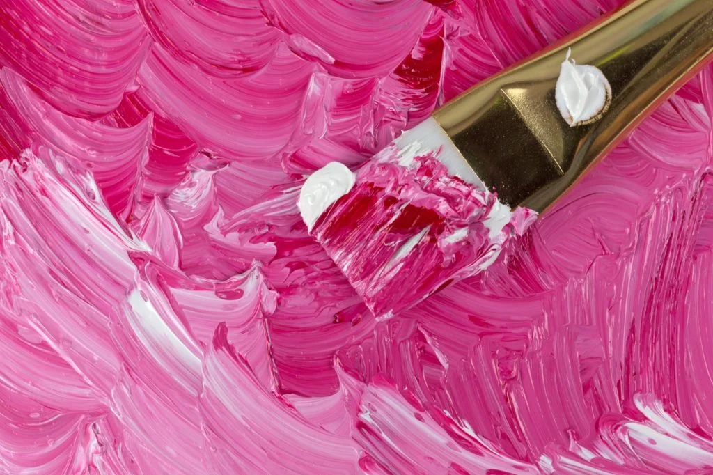
When you’re ready to mix the two paints, make sure you have two equal amounts of each. Using your palette knife, blend the two shades until they are very light pink.
Experiment with different reds as you go. It’s best to use Permanent Alizarin Crimson or Quinacridone red acrylics and mix them with Titanium White.
Red is one of the least expensive colors to dye wool. A small amount of dye gives a nice, even color. To produce a darker shade, mix the color with a little black and add a drop or two of red. Simply mix the color without any other additions to produce a light shade.
Mixing colors is excellent for making pink, which is a color that’s easy to make by mixing other colors. Alizarin Crimson Hue makes a pink color with a bit of purple.
Red is made up of two primary pigments: magenta and carmine. Magenta is the lightest, or least red, of the three colors, and carmine is the darkest. The carmine needs to be diluted to appear on the canvas for the magenta.
You need to make it soft pink by containing it as an ivory pink and darkening it down with orange. Or contain it by using a deep red, such as a cherry red. Moreover, people obtain it by using a light pink or even coral pink.
You can try softening your pink by adding yellow to make it look more like a peach or salmon to look closer to fuchsia. You can also add blue or violet to make it look closer to magenta or magenta.
Mixing Watercolors
Put your brush into a clean water container. Dip it into the water to wet the bristles, press it down on the bottom of the container to open up the bristles, and then run it against the container’s rim to remove the excess water. 2 Place the red and white paints on a mixing surface.
Mix red into your water container. If you’re using wet watercolor, you can squeeze out as much red paint as possible. If you’re using dry watercolors, you can use your brush to paint red onto the surface of your project and mix there.
It may sound crazy, but you can use the same techniques to add color to gray-toned paint. To use the technique, dip your brush into the gray paint and stroke your moist brush over the red paint in your container. Mix the colors until you reach the desired value.
Repeat the process to make the other colors. When you’re finished, mix all the colors. Then add some water to your container as a wet/dry brush. Start by mixing a small amount of the red and white paint to see how they’ll look. Your paint will begin to take on a pink tint. Continue to add more white until you achieve
A great way to add some flair to your wedding is by using different shades of colors. Whether you’re using wet or dry watercolor paints, you can also mix different colors by adding a dab of purple and then yellow or by diluting red with water and not using white.
Experiment to find the right shade of pink for you. Do you want more pink or yellow? You can also experiment by using different kinds of pigments. White makes the color seem even lighter.
It will eventually give you a peach color. A little bit of violet or blue will give you a hot pink. Add more to get a shade such as magenta. Mix in white to get a standard pink. It will make your lips look very hot, and if you use too much, it’ll even make them bleed. Add more to get a shade such as magenta.
what colors make pink food coloring
I always add a small amount of red food coloring to the white frosting when making pink frosting. It makes it more attractive and fun to eat!
Most food colorings can be used in small amounts and don’t affect the flavor of the cake, so start with just a drop and work up to more significant amounts as needed. Alternatives include using rose-colored frosting or colored jelly beans.
If you want to give a pink color to your frosting, you can use alternative colors such as rose or lemon. These lighter food colorings can give a better pink color to your frosting.
The best way to mix in the food coloring is to use a wooden spoon or substitute kitchen implements. Turn over the frosting or other material until you’re sure that the coloring has been absorbed and spread, then add more red coloring as needed.
The color of the cake should be completely dark pink. It should look like you’ve added a bright red food coloring.
Add a lighter color to your pink, such as yellow, and it becomes peachy in appearance. Use a food coloring, such as blue, violet, green, or even brown, to make your pink darker, and it’s now hot pink.
For a brighter pink, try mixing red with purple.
What Colors Make Pink? – How to Make Different Shades of Pink
Pink is such an inspiring color; it’s so feminine and playful. So, I want to talk to you about different ways to make different shades of pink and what you can use to create these pretty colors.
The color pink originated around the 17th century as a variation and a subtle shade of the primary color red. It symbolizes different meanings in different cultures around the world.
In Korea and Japan, pink is the color of trust, and it’s seen as the color of fallen samurai. There are a lot of shades of pink, and you can mix the exact shade of pink you want to use in your work.
Pink – The Basic Color Theory
Before we can understand anything about a particular color, we must first understand how color exists in the first place. The world is a tapestry of different shades and hues, and they can shape a lot of our perceptions about our environment.
Typically, all the colors are aligned on the color wheel. This shape is essential because it helps you see how these hues interact. Hues that sit on opposing sides of the wheel are complementary. It means that they clash fundamentally, which demands your attention.
An example of complementary color is red and green or purple and yellow. An analogy would be the two being next to each other. It is more of a subtle pairing.
How to Make Pink Without White?
It’s best to use a mixture of two or three colors to create a shade of pink that resembles a specific color. If the color you’re trying to replicate is light pink, people use red or pink to achieve better results. Manufacturers add Yellow, green, and orange to a base of red to produce a pale pink. Dark pink is made by adding blue, purple, or magenta.
It is a difficult task if you use white and pink together. Red and Pink both have the same wavelength, so it will cancel out the pink when you add white to pink. However, you can create the effect of a bright pink using red and blue.
The two have a similar wavelength, but they don’t cancel each other out like white does with pink. Use a combination of red and blue, and you will see a vibrant, stunning shade of pink.
How can you make the color pink with food coloring?
The secret to making the color pink is to start with red food coloring and mix in some violet food coloring until you get the right shade. A few drops of water will make the mixture run together to achieve the right color. You can also buy a special kit that includes pre-mixed food colors, so all you have to do is add a few drops of water, and the paint is ready to use.
Is it Possible to Make Different Hues of Pink?
When it comes to devising a design or creating a painting with a particular color, having a palette of different colors gives you depth and dimension. If you’re painting a delicate rose, it’s essential to use darker and lighter shades of the color pink, plus a few other colors to help the painting look realistic. A realistic painting requires depth, dimension, and shadows to make it look alive.
Warm vs. Cool Colors
The best color scheme for your eCommerce website depends on what kind of feeling you want to convey to your customers. Warm colors like red, orange, and yellow are more stimulating than cool colors like purple, blue, and green.
Pink is made of red, the base color for pink. Warm colors are usually red, so it’s essential to consider the color pink in this context. The red in pink is used to create warmth. It gives it emotional meaning that can be used to create powerful messages about relationships and emotions.
Tips for Getting the Hue of Pink You Want
The right color is white. Now that we’ve covered the two primary colors that make pink, you’re ready to start mixing. Use white and red to get that perfect pink.
Then you can check out our three top tips to help you create the exact color you want. We highly recommend using Pantone’s online color tool as a way of helping you visualize various shades of pink.
Select a Hue
Choose a suitable color scheme for your space. Hue is the key to creating a beautiful color scheme for your room. When planning your interior design, choosing colors that complement each other in tone, value, or both will help create a warm and inviting space.
To get a warm pink, start with a warm red hue. These hues are a little more bright, and they’ll be very yellow. If you want a cool pink, choose a cool red. The more fabulous shades have a blue, green, or purple undertone.
Consider Darkness and Light
Choose a hue in the color wheel that most closely matches your color’s actual color.
If you want to go for a bright shade of pink, try using a warm red hue. It will have undertones of yellow or orange and for a cool pink, use a cool red hue. These shades will have a blue, green, or purple undertone.
Adapt the Saturation
The hue saturation will determine how intense the color is, i.e., how many primary hues (red, blue, and yellow) are included. It affects the color’s vibrancy.
To create a bright fuchsia or magenta color, you should increase the saturation. You should do this by turning the saturation dial-up. Colors with a lot of white or black in them are less saturated.
Conclusion
Undoubtedly, Pink is the color of nurturing and calm that makes you feel soothing and relaxing. Isn’t it? Or do you still think it is a girl’s color? Whatever, when it comes to what colors make pink? Then it will be love and peace. We have provided you with the details about the making process and different shades, along with tips to manage the hues. Make your own pink and live freely. Wouldn’t you?